Why Upgrade Your Restaurant PDF Menu for Better Online Ordering and More Sales
A PDF menu can look polished, but it often creates friction at the exact moment a guest is ready to order. On a laptop, that friction may be small. On a phone, it can be enough to lose the sale.
Online ordering works best when the menu is easy to read, easy to customize, and easy to buy from. A static PDF rarely does all three well. Upgrading it into an interactive online menu can make ordering simpler for guests and more profitable for the restaurant.

Static PDF menus slow down online ordering
PDF menus were designed to preserve a printed layout. That makes sense for a file meant to be downloaded, printed, or emailed. It does not always make sense for online ordering.
The most common problems show up quickly:
Guests have to pinch and zoom to read small text.
Menu sections can feel crowded on smaller phone screens.
Prices, hours, and item availability can become outdated.
Dietary details and modifiers may be hard to find.
Guests may need to switch from the PDF to a separate ordering page.
Large PDF files can load slowly on mobile connections.
That extra work matters. A hungry guest wants to know what is available, what it costs, and how to order. If the menu forces them to search, zoom, backtrack, or call the restaurant, the ordering process feels harder than it should.
A PDF can also make updates more difficult. If an item sells out, a price changes, or a seasonal special ends, someone has to revise the file, upload it, and make sure the old version is no longer linked anywhere. Even one outdated menu can create confusion and unhappy customers.
Interactive online menus make ordering easier
An interactive menu turns the menu into part of the ordering experience rather than a separate document. Guests can browse, choose, customize, and add items to a cart without leaving the page.
That can include useful features such as:
Clickable categories that make appetizers, entrees, drinks, and desserts easy to scan.
Item photos that help guests choose faster.
Modifier options for toppings, sides, sizes, spice levels, and substitutions.
Dietary labels for vegetarian, gluten-free, dairy-free, spicy, or popular items.
Real-time item availability so sold-out dishes do not cause frustration.
Clear cart and checkout buttons that keep guests moving toward purchase.
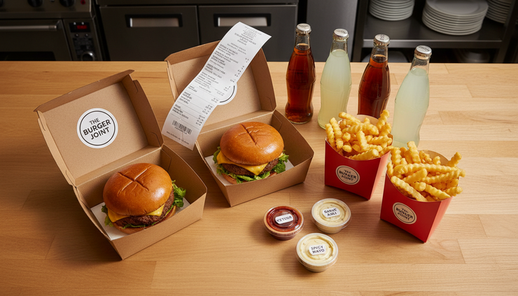
A strong online menu also helps the restaurant guide decisions. For example, a burger listing can suggest fries, a drink, or an extra sauce at the right moment. A pizza item can show crust options, premium toppings, and dipping sauces without requiring staff to explain them over the phone.
Static PDF menu
Best for viewing a fixed layout, but often requires zooming and extra steps to order.
Updates require replacing the file.
Guests may miss add-ons or modifiers.
Interactive online menu
Built for browsing, customizing, and ordering in one place.
Updates can appear quickly across the live menu.
Add-ons and choices appear during checkout.

Better menus improve the customer experience
A good online menu answers questions before they become obstacles. What comes with the dish? Can it be made spicy? Is there a kids' portion? Can the side be changed? Does the item contain nuts?
When those answers are easy to find, guests feel more confident placing an order. They also make fewer calls to the restaurant, which helps staff focus on food preparation and in-house service.
There is also an emotional side to ordering. A clear menu feels trustworthy. Fresh photos, accurate descriptions, and simple choices make the restaurant look organized and reliable. By contrast, an old PDF with tiny text or outdated prices can make guests wonder what else might be out of date.
Improved menus can also reduce mistakes. If customers select their own modifiers from clear options, there is less chance of a phone order being misheard. If required choices are built into the menu, such as sauce selection or side choice, the order is more likely to arrive complete.
Good descriptions help too. Instead of listing only “Chicken Sandwich,” an online menu can include:
“Crispy chicken breast with pickles, lettuce, house sauce, and a toasted brioche bun. Served with fries.”
That one sentence gives the guest more reason to order and sets clearer expectations.
Improved menus can increase online orders
A better menu does not just look cleaner. It can help guests complete more orders and build higher-value carts.
Small details can make a big difference:
A popular item badge can help a first-time guest choose.
Add-on prompts can increase side orders, desserts, sauces, and drinks.
Combo options can make ordering faster.
Clear photos can reduce hesitation.
Simple checkout steps can lower abandoned carts.
The goal is not to pressure guests. The goal is to make the next good choice obvious. If someone orders pasta, showing garlic bread nearby is helpful. If someone orders wings, offering extra ranch or blue cheese makes sense. If a family bundle includes clear portions, guests can decide faster.
A restaurant PDF menu for better online ordering should also reflect how people browse. Many guests do not read every item from top to bottom. They scan. They jump between categories. They compare prices. They look for something familiar, then something tempting. An interactive menu supports that behavior better than a static file.
Make online menus work better on mobile devices
Most online food orders start on a phone, so the mobile version of the menu deserves careful attention. A menu that looks good on a desktop but feels cramped on a phone still creates friction.
Use these practical tips to improve the mobile ordering experience.
Keep text readable without zooming
Menu item names, prices, and descriptions should be easy to read on a small screen. Avoid tiny type and long blocks of text. Keep descriptions short, useful, and specific.
Make buttons easy to tap
Buttons for `Add to cart`, quantity, modifiers, and checkout should be large enough for thumbs. Place them where guests expect to find them, and avoid putting important buttons too close together.
Organize categories clearly
Use simple category names such as Burgers, Pizza, Salads, Kids, Drinks, and Desserts. Keep the most ordered sections easy to reach. If the menu is long, add sticky category navigation or a search feature.
Use photos carefully
Photos can help sell food, but they should load quickly and match the item. Use bright, accurate images that show the dish clearly. Avoid using a photo if it makes the item look very different from what guests receive.
Show the cart and checkout path clearly
Guests should always know what they have selected and how to finish the order. A sticky cart button or visible checkout link can help them move forward without hunting for the next step.
Test the menu like a real customer
Place a test order on different phones. Try adding modifiers, removing items, changing quantities, and checking out. If any step feels confusing, guests will feel it too.

A better menu makes ordering feel easy
A PDF menu can still be useful as a backup or printable option, but it should not be the main path for online ordering. Guests expect a menu that fits their screen, answers their questions, and lets them order without extra steps.
The right online menu can improve accuracy, reduce friction, highlight high-value items, and make the whole experience feel more inviting. Start with the basics: clear categories, readable text, accurate prices, simple modifiers, fast mobile loading, and an easy checkout path.
When the menu is easier to use, customers are more likely to finish their orders and come back the next time they are hungry.


Comments